AI Infographic Maker
How to Make an Infographic for LinkedIn (That Gets Engagement)
The right size, format, and style for LinkedIn infographics — plus how to turn a post or report into a professional graphic that stops the scroll.
Published August 11, 2026
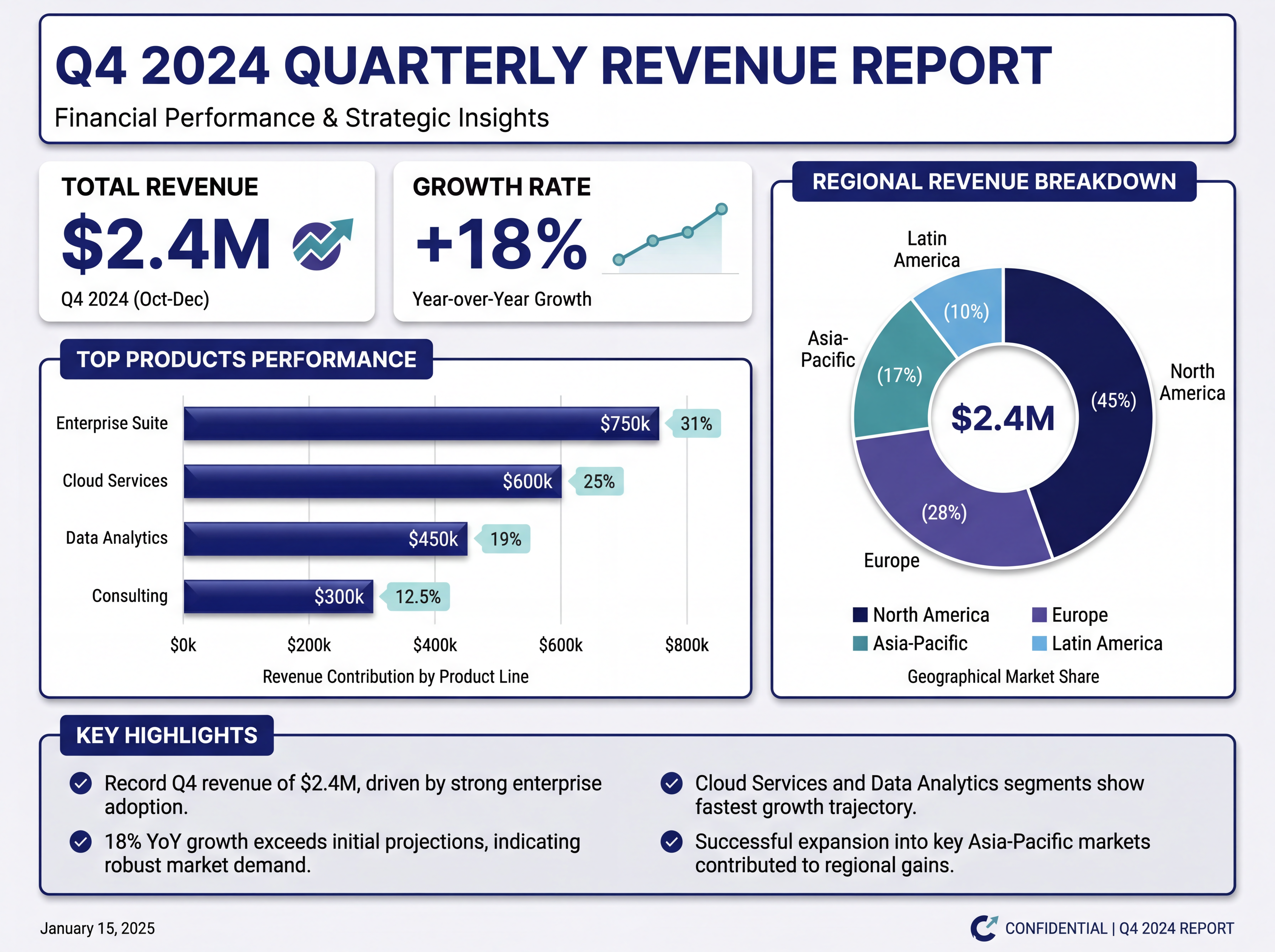
A LinkedIn infographic works when it delivers one credible, useful insight in a clean, professional style — sized to claim space in the feed. LinkedIn's audience rewards substance over flash, so the win is a specific takeaway they can act on, not decoration. Here's how to make one that earns saves and shares.
Size and format
- Portrait (4:5, 1080×1350) claims the most vertical feed space.
- Square (1:1, 1080×1080) is a safe, clean alternative.
- For a carousel/document post, use several 4:5 pages, one idea each.
What makes it perform on LinkedIn
- One credible insight, ideally with a number or a specific claim.
- A professional, restrained style — this isn't the place for neon.
- High contrast so it's legible on a phone.
- A hook caption that opens with the takeaway, not "Excited to share…".
Step by step
- Lead with one insight your audience can use.
- Choose 4:5 or 1:1 for the feed.
- Pick a corporate, high-contrast style.
- Generate, then refine wording and emphasis.
- Write a hook caption that repeats the core point.
One thing that doubles engagement
Specificity. "We cut onboarding time 38% by removing three steps" outperforms "tips to improve onboarding." Put the specific number in the graphic and repeat it in your caption.